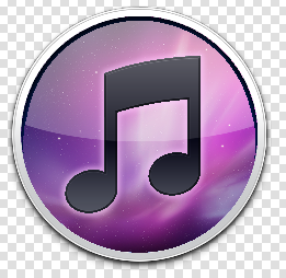
I’ve watched the iTunes icon evolve with much interest from the very beginning. There are only two elements, but the color and style of the notes and the surface of the CD have proven to be nice canvases for iteration. By the time they got to the bright blue notes, I think this design had been polished about as much as possible.
With iTunes 10 Apple has made the first big change to the app’s icon. The circularity and notes are preserved, but the CD has necessarily been ditched. When iTunes first came out, CDs were the means via which music was distributed, and iTunes could rip and burn them so the notes on a disc metaphor was apt. At this point iTunes and the portable devices it interacts with have left CDs in the past and the App itself represents the way most people interact with music.
I like the new design a lot. The now cartoony notes are more expressive, and the rounded button is boldly iconic and resembles a rounded iOS touch icon. The Flurry System and Extras icons from the Iconfactory's David Lanham have a similar feel, but squared. It’s exactly what the icon had to become I think and a nice simplification of the core concept. It's also leaves room for further variation and evolution, much like the original did.
I think it would be fun to make a series of variations myself of this new icon. There is a lot here to be played with even in this simple framework. The silhouetted notes, infinite background possibilities, and ring can all be adjusted to bold effect. Here's a proof-of-concept draft:

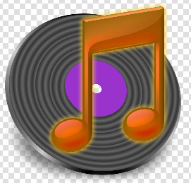
I also have an idea for a final send-off of the old iTunes icon. I’ve seen it done a few places on the web, but not quite satisfactorily. I'll be working on making this one properly detailed, but you get the drift immediately. As the icon has evolved to remove the no longer relevant CD element, why not go back in time and put out a vinyl version?

I think that'll be fun. The wax needs a lot of work, and I'm thinking about going with a wood finish for the notes. Rusty orange is working for me too though so far.
These are all obviously quite derivative ideas, but I consider them visual commentary on a visual world and therefore legal.
UPDATE: iTunes 11 has been released, with yet another evolution of the icon, and now 12 which is a stylistic break but keeping with the same concept.